Every year I take at least one pro-bono client and help them redesign their website. In 2018, that was Children of Bulgaria. Why does a charity website need a nice design? Because in order to get people’s attention and ask for a donation, your website needs to at least make it clear what your mission is and why what you are doing is so important.
The old page of COB didn’t seem to do that. So, I decided to redesign it and my objective was- increase the number of donations.
In this blog post, I am going to guide you through the process of re-designing a charity website.
Step 1 Set a Goal
Pin down the facts and the reasons. Why are you going for a redesign?
As mentioned above, the COB page was not really user-friendly and it was really hard to understand what the organization stands for and why and how you can help them achieve that goal with a small donation.
They did receive donations, but mostly through e-mail campaigns or referrals. So, the goal of the redesign was to increase the number of donations coming from the website.
Step 2 Perform a UX Audit
Perform a thorough analysis of the website, identity usability problems and see how you want to fix them. That’s what I call a UX audit. Also, if you have data stored in Google Analytics, make sure to utilize it- dig for usability problems or patterns of user behavior. Here’s a nice article on the importance of UX audits.
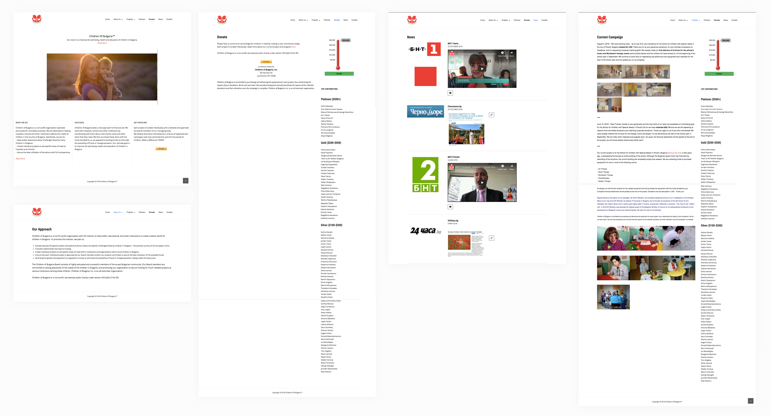
I spent a few hours looking at the website and writing down the major problems:
Homepage
👉🏻No clear CTA button
👉🏻Page too short; fails to convey the main message
Current Campaign Page
👉🏻No CTA button
👉🏻 Listing all top contributors is great, but putting a long list in the sidebar is not the best decision. It makes the page unnecessary long.
👉🏻The goal thermometer, which indicates how much money has been raised, is a great feature but is underutilized.
About Page
👉🏻The about section is divided into 3 short pages.
👉🏻All 3 pages: Board of Directors, History, Vision and Mission are fairly short. Especially the History page.
News Page
👉🏻There is a lot of media coverage, but it’s not presented in a nice way.
👉🏻News coverage information is hidden.
The Donate Page
This was the most important page of the whole website because this is where a user would click to make a donation.
I found it weird that there is a special page where you can go to, in order to make a donation. As you can see below, it gives you a little bit of text, an explanation about tax redemption and a donate button. I believe there is no need for a separate donation page though and that it should be integrated in the existing pages.

Once I wrote down all my notes and observations, I moved on to the next task- creating a sitemap.
Step 3 Create a Sitemap
While performing an audit, you might realize that you need to re-organize the website, add different pages etc. therefore, I recommend creating a new sitemap.
Before jumping into the redesign process and trying to prettify the pages, it’s important to re-evaluate the website’s structure and adjust it, if you think it makes sense.
In this case, I strongly believed COB needs a more logical structure, so I created a new sitemap using Draw.io.
I merged some of the about pages and re-organized the projects’ structure.

Step 4 Make a List of all Plugins (skip if you are not using WordPress)
This is only applicable if you are using WordPress to redesign a website.
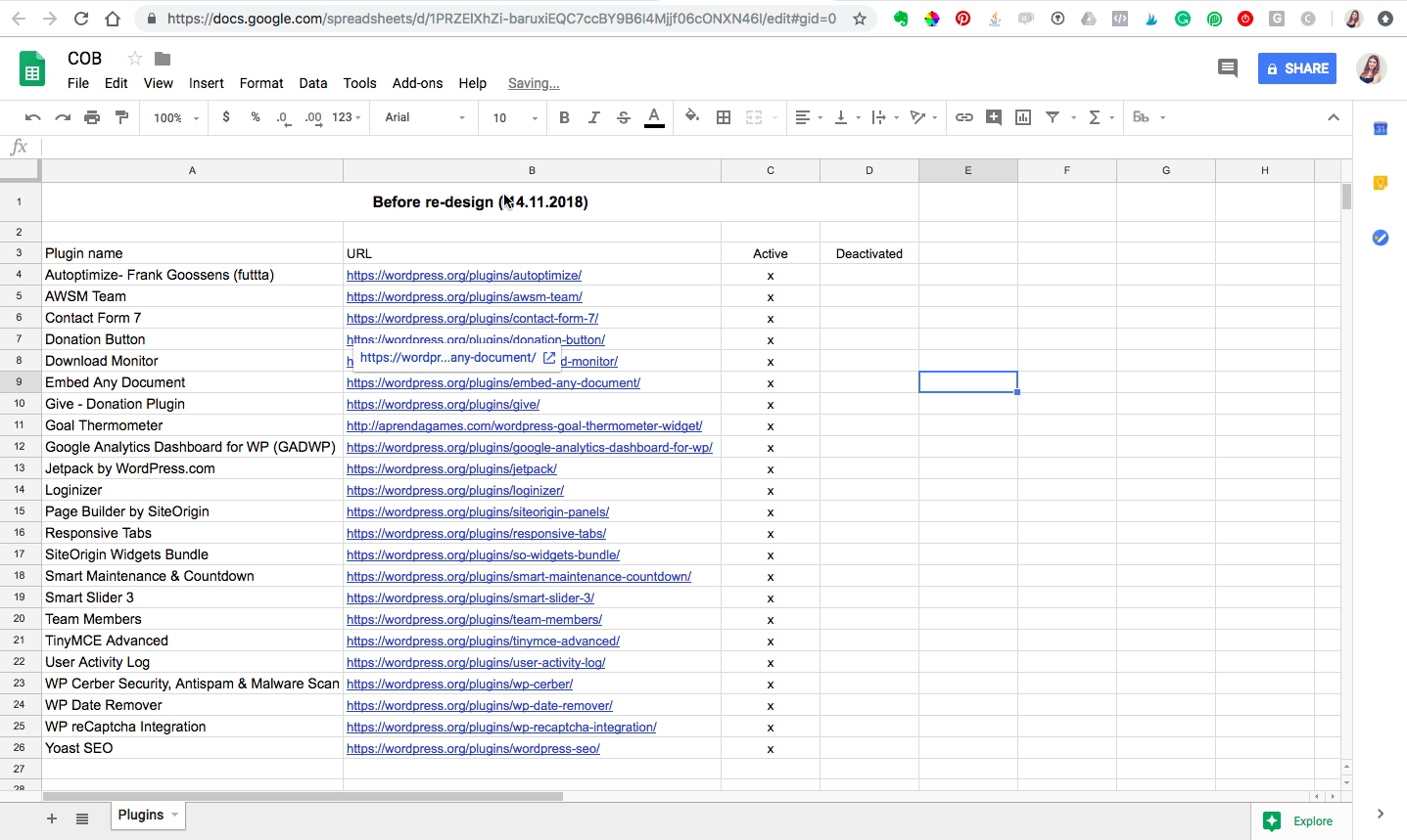
Before I moved on to working on the new UI design of the pages, I took the time to make an inventory of all installed WordPress Plugins.
This is an important step because you might find yourself needing one of the plugins later or might realize that some sections of your new beautiful website simply don’t work because you’ve deleted the plugins.
I simply copied the name and the Plugin URL into a Google Spreadsheet for later reference. After that, I deleted the plugins I thought are no longer needed.

Having too many plugins is never a good idea and the new WP theme I was going to install came already with lots of new plugins.
Step 5 Create Wireframes
Once you have a clear understanding of how you want to structure the website, you can move on to visualizing it.
When doing a website redesign, the new UI is the first thing that everyone notices about the website. Since I am first creating wireframes, I would definitely want to to do the UI in Sketch first, before building it in WordPress.
I strongly advise you to create wireframes for all pages before you start designing it in WordPress or coding it.
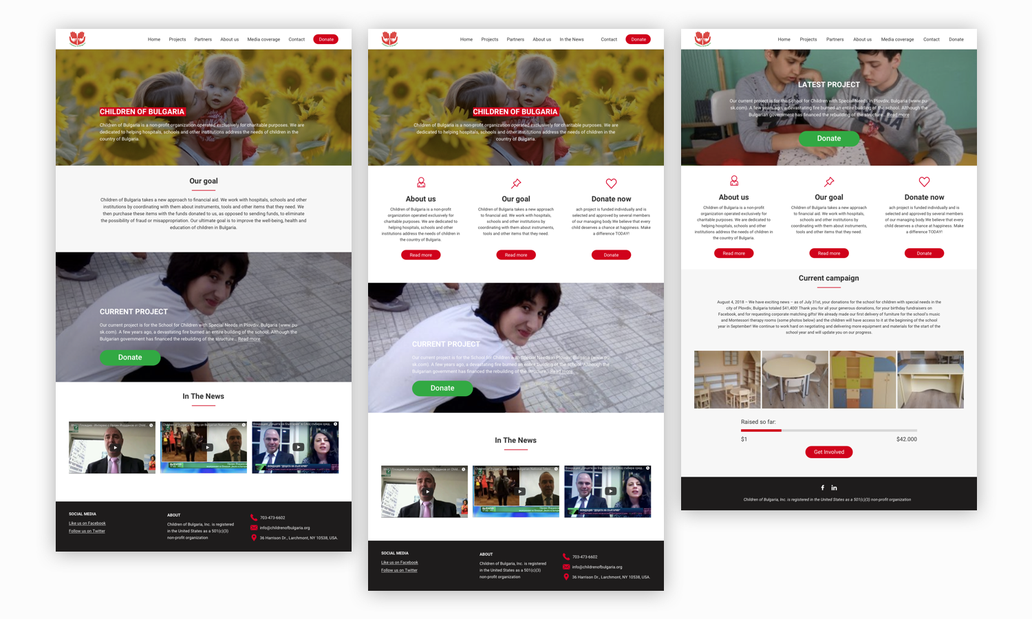
Usually, I start with the homepage and continue with the most important pages. I came up with 3 different options for the Homepage and presented them to get initial feedback.

After that, I worked on refining them and we picked a winner. Based on that, I came up with the UI for the rest of the pages.
Step 6 Build Your Pages Inside WordPress
The last step is to take the designs you have created in step 5 and actually produce the pages in WordPress (or code them yourself).
I usually use a website builder for that since I can’t code. My favorite plugin is Visual Composer. I have tried many, many plugins over the years but this one is just the BEST.
I needed about 8 hours to re-create most pages in WordPress. I didn’t manage to re-design ALL of them, but just the most important ones. The website was down for 48 hours, and after we re-launched it the donations increased exponentially!
Redesigning a charity website is NOT an easy task. I believe that the single most important thing that increases donations, aside from the colors and usability, is prompting the user to donate.
This can be achieved by positioning the Call-To-Action button (the donation button) prominently and by using lots of genuine images. They evoke emotions and help you convey your message.
Have you done a (re) design for a charity page? I’d be interested in hearing your feedback. Drop a comment below 👇🏻👇🏻
Xoxo Iglika


