UX Audit & Subscription flow redesign
Macro Hive is a leading independent provider of global macro and financial market research, and a digital financial media firm. They were having serious issues with dropping subscription rates and needed me to look into their subscription flow.

(01 ) Project Overview
Mission
Main goal was to increase the premium subscription rate . MacroHive's main problem was the low conversion rate, that is the number of people visiting the site vs. those who purchased a premium subscription. They were looking to increase the subscription rate and give the website a new look.
Outcome
By performing a page-by-page UX analysis of the entire premium subscription flow as well as key pages, I was able to identify critical UX flaws and propose a solution. In addition, I created a new style guide and redesigned the homepage.

(02) Project Background
Project objectives
Increase Number of Premium Subscribers
The main reason for conducting an UX audit was to detect the main issues responsible for the low conversion of the users visiting the website. Naturally, the objective was to increase the number of subscribers.
Identify key problems with the UX on the website, new 'look and feel'
The client had access to a lot of user data via Google Analytics and HotJar which was never used. It was crucial to go through the data and use the information to make better design decision while creating the new pages and searching for the best solution.
Based on the findings of the UX Audit, the goal was to propose a new design of the homepage as well as all the screens involved in the premium subscription flow.


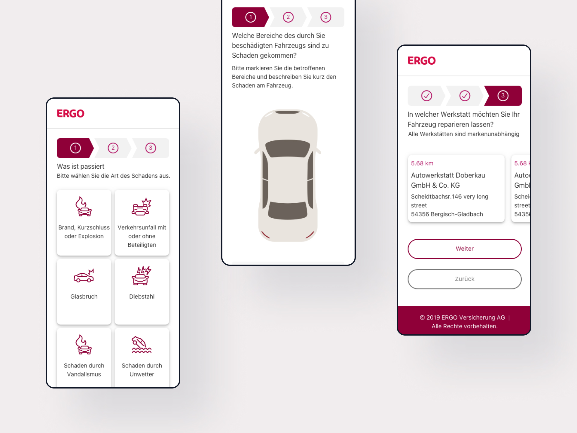
(03) Process
UX Audit Process
- To start with, I collected and evaluated all the user data available in GA and HotJar.
- After that, I created the user personas as well as the Customer Journey.
- Next, I looked into the information architecture (sitemap) and offered a better solution.
- Then, I took a deeper look into the current subscription flow, found the reasons for the low conversions and suggested an optimized version of the flow.
- The rest of the work consisted of screen-by-screen analysis which included improvement suggestions.
Solutions
Increase Number of Premium Subscribers
The low number of subscribers was due to the fact that the website was structured poorly, it was difficult to understand what the product actually is and what one gets after one subscribes. Also, the subscription flow itself was not optimal.
MacroHive was simultaneously asking the user to sign up for the Free Newsletter AND without asking forwarding to the subscription page.
The user doesn’t know yet if the product is a good fit and what to expect. Even though the conversion rate in the beginning of the flow may be seemingly high, you see huge cancellation rates once user is out if trial period (over 75%).
New suggested user flow
User is informed about the content of the free newsletter, and signs up. On the thank you page (after user has subscribed) add a one-time offer for a monthly subscription (f.e. 50% off).


(03) Process
Information Architecture
Before: Lots of duplicated content; Important pages are hidden under the wrong menu title.

After: Highlights Membership type and Services to help the user navigate through the products.

Identifying key problems with the UX on the website
Using a screen-by-screen analysis, I identified UX issues that needed to be fixed and offered possible solutions. You can read an excerpt of the report here.

(04) Outcome
New Look and Feel
MacroHive did not have a brand style guide and was using a lot of bright orange on the website. There were multiple discrepancies between text sizes and colors, button colors and an overall lack of a consistency in the color palette.Created a document developers and designers are referring to when creating new pages or updating existing ones. Using the same button and text styles throughout the website creates brand recognition and increases the chances of conversion.
You can view all screens here.
(05) Results
10% increase of conversion rates, Decreased bounce rate and better lead quality
After the design was handed to the developers, the new website launched early June 2021. Around a month after that we took a look at the numbers in Google Analytics to see how the conversion rates have changed. Moreover, MacroHive reported that the quality of the leads they are getting through the website now has improved significantly. Also, according to Analytics the user was spending 2 x more time on the website compared to before the redesign.